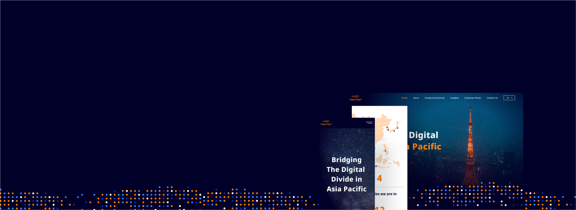
A modern website to bridge the digital divide in Asia Pacific.
Digital Edge builds and operates state-of-the-art, energy-efficient data centres rich with connectivity options, established to transform digital infrastructure across the Asia Pacific. Their corporate website needed a look and feel that showcases what they do. To kickstart their new website, we worked with Bonsey Jaden to revitalise their brand identity and come up with a signature element, which is the Hyper Grid.
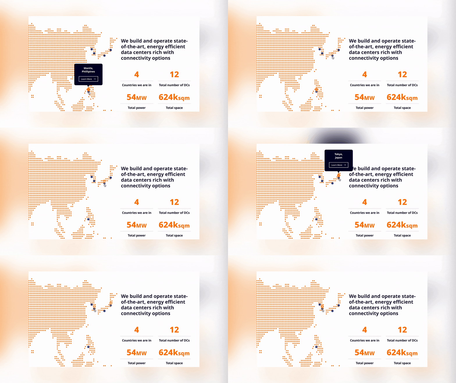
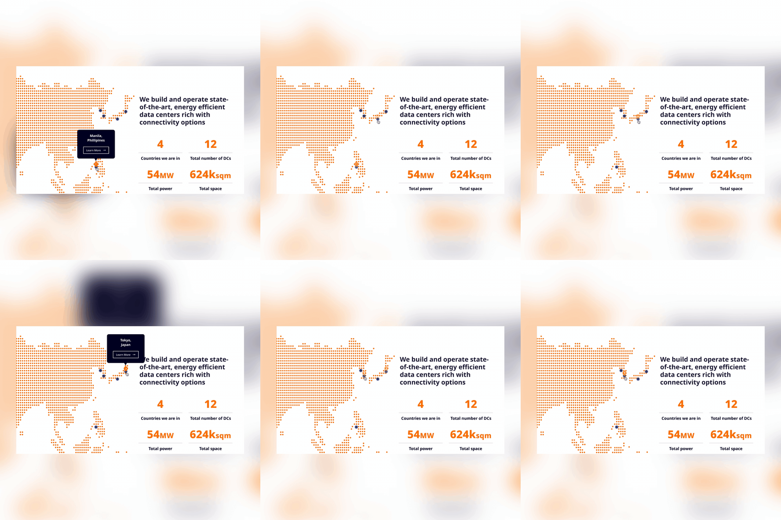
We listed several main points on what their new corporate website needed. Point one is regarding the expression of their new brand image. To express their brand one step further, we implemented the Hyper Grids. These Hyper Grids are combinations of strategic placements of blue, orange and white dots that make up an image. Aside from its visual aspects, the website needs to provide the right resources to help educate both current and potential customers. These resources also come in several language, making the site multi-lingual.
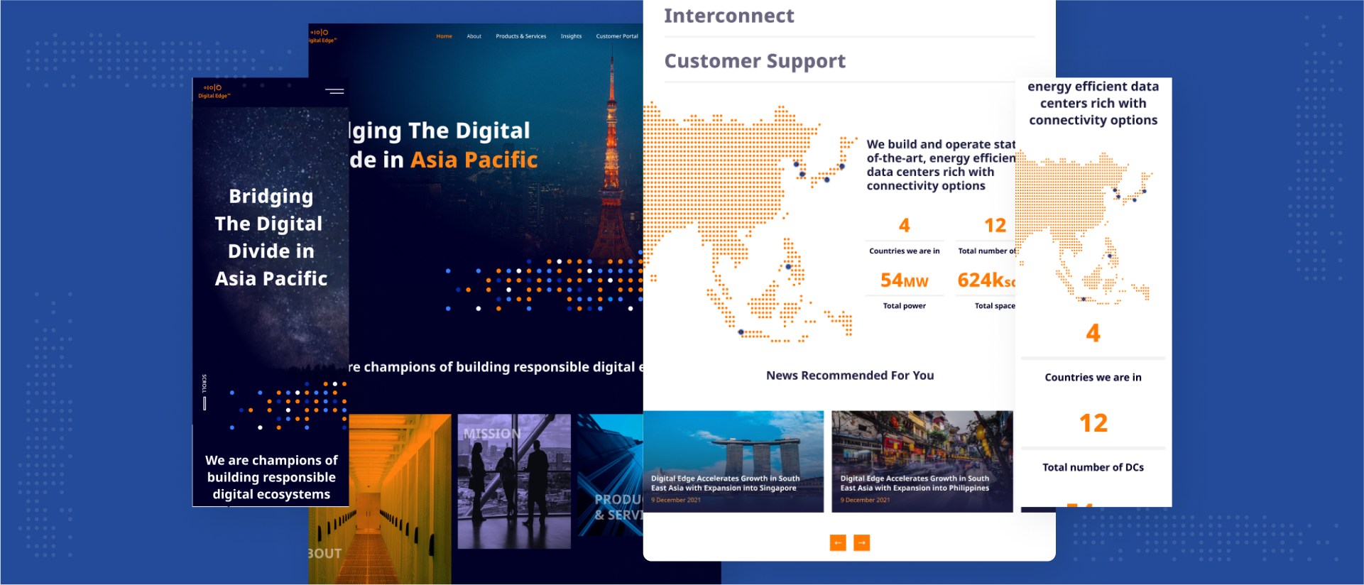
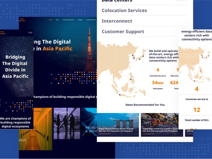
We implemented the design thinking phases to this project, starting with the identification of users and competitors. Our team performed competitor and website analysis, with user personas to define design attributes that complemented target users. Once insights are gained, seamless new information architecture is curated and wireframes are built to consolidate solutions with the client. These wireframes are then turned into high-fidelity prototypes with engaging interactions.
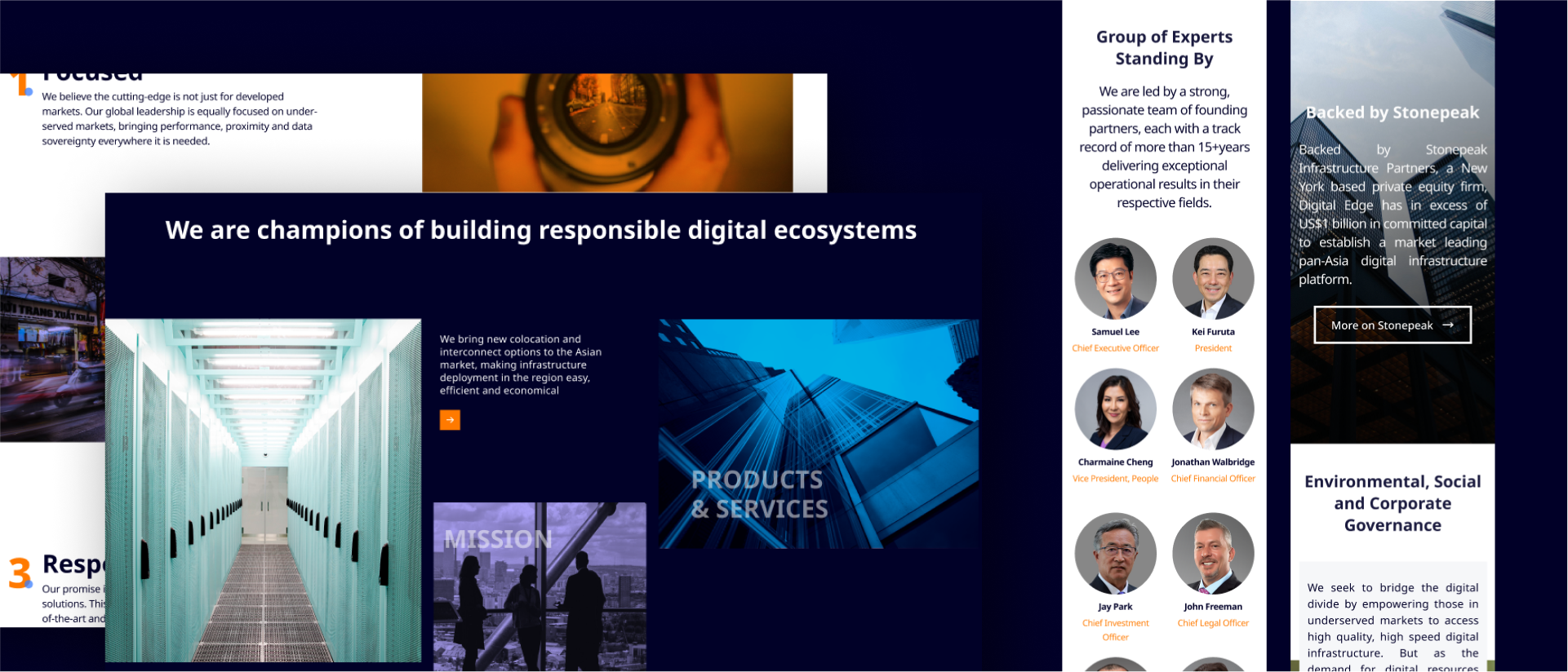
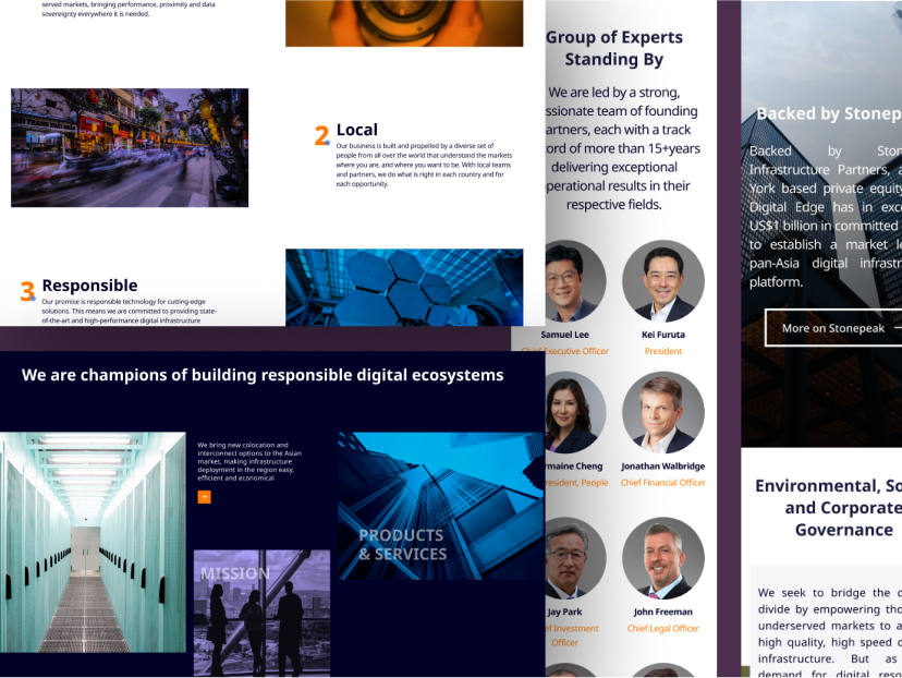
Digital Edge users catered to 2 big circles: the hyper-scalers and retailers. As this website has to cater to both types, this is where content organization came to play. Curating a streamlined information architecture was one of the first things we do to ensure that the website is informative but not burdensome to its audience. The wireframing process was crucial to clarify consistent ways for displaying particular types of information on the user interface. They were also used to align with the client in determining the intended functionality of the interface.
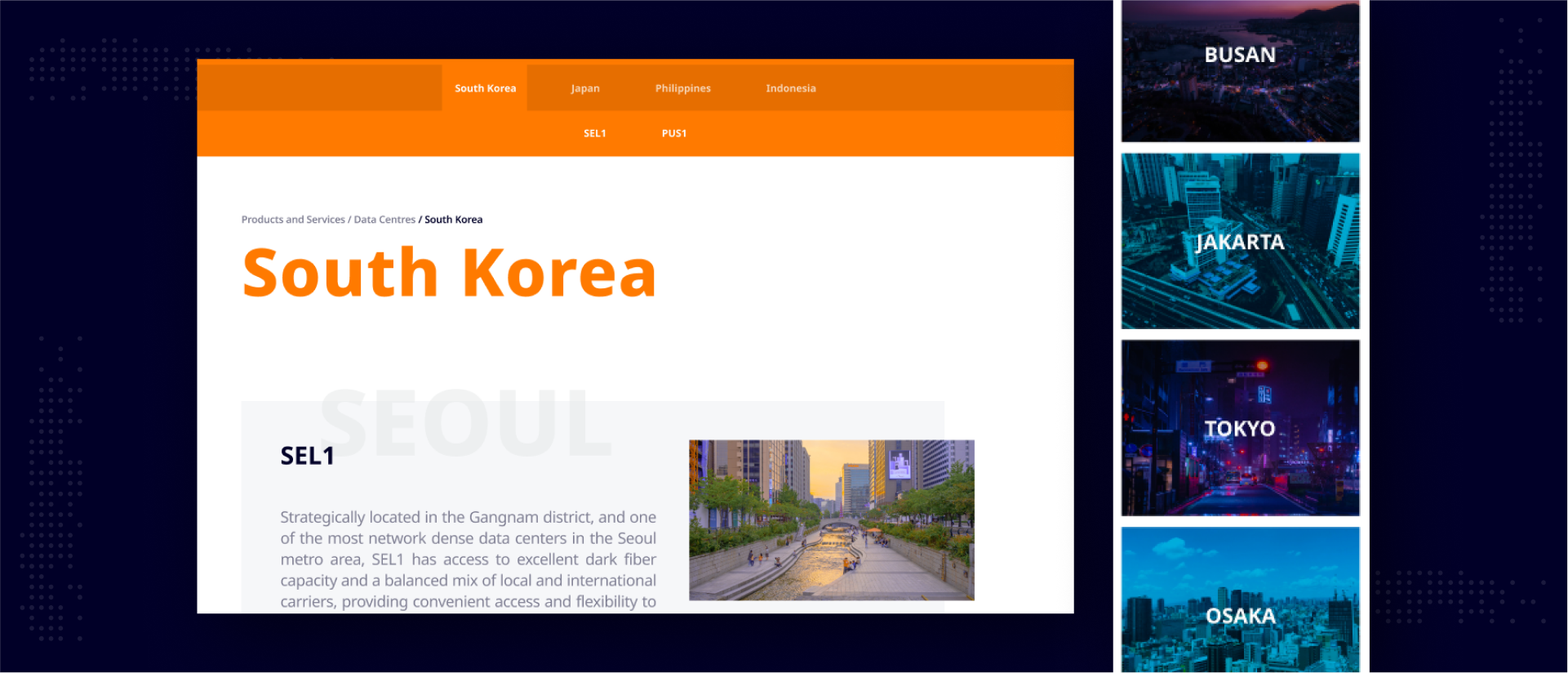
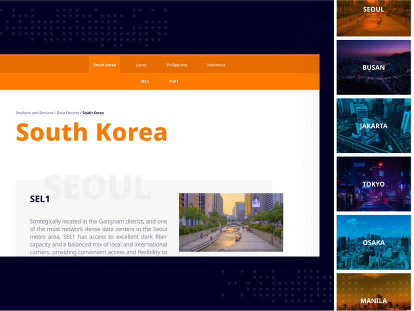
A SYSTEM FOR ALL
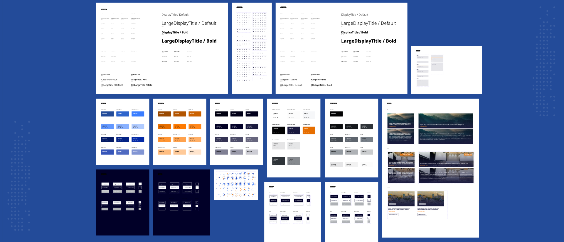
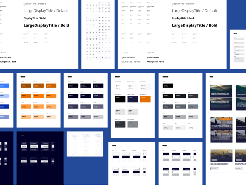
A design system was built based on Digital Edge’s refreshed brand identity, to scale not only for the website, but across all digital collaterals. Having the website to be on-brand was crucial to the client. Thus, we provided insights on how the brand can align with accessibility. The components, micro-interactions and visual directions are planned to flow to Digital Edge’s customer portal that is still in design & development phase.
